Driving 25% performance through UX-led decision making
How a Ryobi x IDHL partnership unlocked long-term digital performance
- Case Studies
- Ryobi Tools

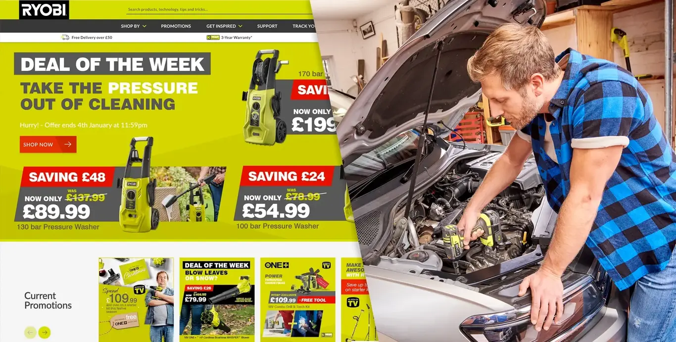
Ryobi, part of the TTi Group, is a market-leading manufacturer of innovative home and garden power tools. As a long-standing IDHL client of over 10 years, Ryobi’s digital estate has evolved significantly — from a brochureware website to a transactional, internationally scaled platform focused on engagement, performance and measurable return
- Client
- Ryobi Tools
- Website
- Visit Site
- Category
- Home & Garden
- Services
- Web and Technology
- Strategy and Consultancy
- Partners
The challenge
Ryobi’s transition into eCommerce gave the brand strong foundations, but the next phase of growth required optimisation. Product pages, the lifeblood of any transactional site, needed to deliver the right information, in the right place, for a wide range of users across multiple international markets.
Contrasting design feedback from different regions resulting in inconsistent product page layouts across markets, making it difficult to align teams or prove what worked best. At the same time, Ryobi wanted to expand exposure and engagement across 20 European sites, improve navigation for a vast product range, and increase ROI through smarter digital touchpoints such as reviews and store locators.


Our approach
UX-led strategy & research
Using a comprehensive UX testing programme, we removed subjectivity from Ryobi’s decision making. This included persona definition using the M3 framework, competitor analysis across key markets, first‑impression testing, and remote usability reviews using Hotjar. These insights allowed us to understand user intent, uncover friction points and identify genuine conversion blockers.
Data-backed design consistency
Real user behaviour formed the foundation to standardise product pages that still meet user needs, providing a clear set of recommendations to apply across markets. This enabled Ryobi to confidently align global teams around a consistent, performance-focused product page framework.
Platform & engagement enhancements
Alongside UX optimisation, we supported Ryobi’s wider digital growth through platform enhancements. This included bespoke integration between the CMS and Ryobi’s Product Information Management system, interactive product features, video and animation, user reviews, and improved navigation to support discovery.
A custom translation importer enabled seamless management across 20 languages, while email newsletters via Kentico EMS helped build engagement and brand loyalty.
The results
As Ryobi’s long‑term digital partner, IDHL continues to support the brand, ensuring their digital experience evolves in line with user needs and commercial objectives. Our collaboration generated some truly impressive wins.

Joe Wicks, Digital Marketing Manager, Ryobi Tools"We have partnered with IDHL for over a decade and they have been fundamental in growing our online presence across Europe. They have made fantastic developments to website performance and we are currently implementing features of the Kentico EMS. The team is a joy to work with and is always prepared to go the extra mile."
Client Case Studies
 London Chamber Of Commerce and Industry
Connecting members at scale with +250% online applications
- Membership
- Web and Technology
- Kentico
 The Institution Of Structural Engineers
242% increase in sales volume from a smarter Kentico rebuild
- Membership
- Web and Technology
- Kentico
 Marshalls
200,000+ new site users with one game-changing relaunch
- Professional services
- Web and Technology
- Kentico
Have a new project to start?
We’re ready to help you stand out in the digital world. It’s time to grow your business with class-leading solutions and expertise.